
LFW 2025 SPRING/SUMMER
LFW 2025 SPRING/SUMMER

A unique colour palette combines comfort and creativity, offering a hopeful view of the future. The surprising mix of shades at LFW Spring/Summer 2025 blends romance and practicality, creating a fresh and positive atmosphere. This lively palette includes bright colours, eco-friendly tones, classic country hues, and clean monochromes, encouraging a sense of freedom with its modern contrasts. Bold colours challenge the norm, inspiring self-expression for the future.
The colours for LFW Spring/Summer 2025 represent a revived sense of freedom. By merging traditional charm with modern style, this diverse colour collection reflects our desire for personal liberty, urging us to explore, express ourselves, and celebrate our individuality.
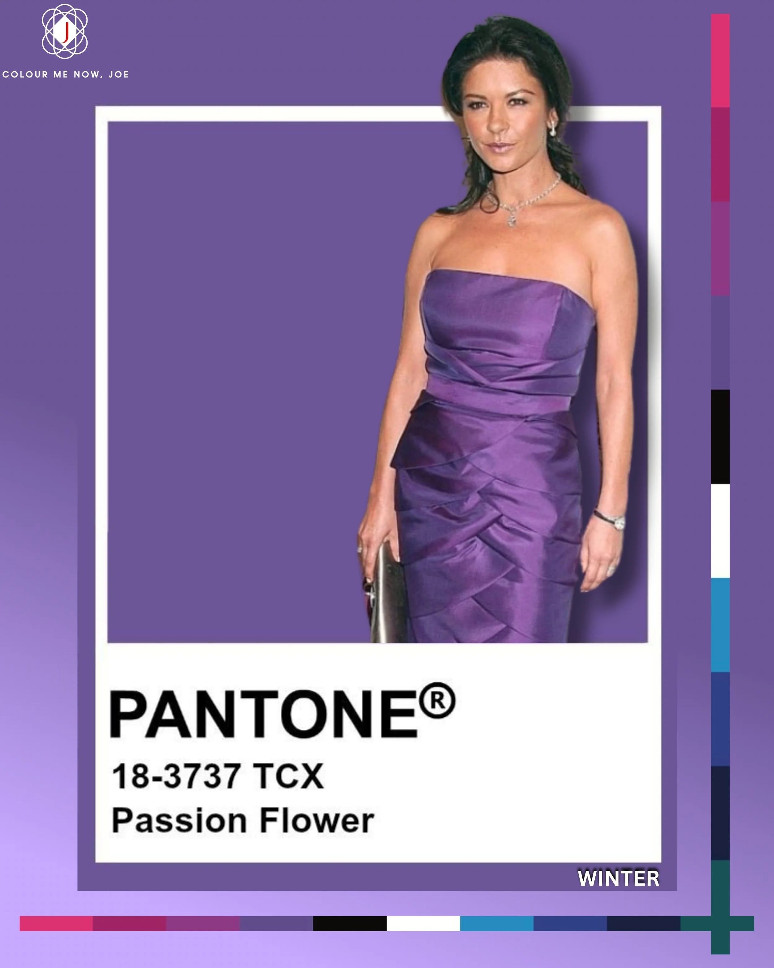
Pantone's Passion Flower is a deep, purplish-pink shade with undertones of fuchsia. This is one of the Spring/Summer 2025 colours, which you will see this season too often. It is a rich, elegant and a vibrant hue, definitely sophisticated one. Perfect for pairing with brilliant white and winters pinks such as fuchsia. Also great with emerald green. Winter types will shine in this beautiful purple colour 💜

Airy Blue evokes a light, serene, and refreshing feel - much like a clear sky on a bright day. Its soft, pastel hue offering a gentle and optimistic aesthetic. Beautiful pairing with soft and sophisticated colours, such as powder pink or light grey. A perfect colour for all types with lighter and delicate face characteristics.

Pantone's White Grape is a delicate and refreshing hue that embodies a soft, muted green with a hint of warmth, reminiscent of the fresh and tranquil feel of early spring. Beautiful when paired with creamy whites, biscuit brown and warm reds for a contrasting outfit. Wonderful colour for Springs 💚

Pantone's Pear Sorbet is a delicate, pastel yellow with a mellow warmth that evokes the light, juicy sweetness of a summer pear. Its gentle hue feels fresh and uplifting, adding a soft glow of optimism and charm. You can pair this beautiful yellow with muted pastels like powder blue, lavender mist, or blush pink. Very nice with sage green too. If you are a Summer soft, this is the right yellow for you. Autumns soft can wear this colour too

Viridian Green is a deep, blue-leaning green that evokes a sense of tranquillity, elegance, and timeless style. It’s a versatile shade - modern yet classic - perfect for making a bold, confident statement without being overpowering. Perfect in pairing with white or black, but gorgeous with purple too. If you want to look rich, pair with rich burgundy or silver. Winters will shine in this beautiful colour 💚

Yellow Jasper is a bold, luminous yellow infused with a subtle blue undertone that gives it a crisp and contemporary feel. Unlike warm, sun-baked yellows, this shade is cool, energetic, and almost electric — making it ideal for colour palettes that aim to be eye-catching, vibrant, and forward-thinking. It goes beautifully with navy, cobalt, or even soft lilac tones. For a bold contrast go for deep purple. Winters, especially in bright subgroup, should go for this colour this season 💛

Camellia is a lively, warm shade of red that exudes energy and vibrancy, evoking feelings of passion and confidence. Its warm tones evoke a sense of luxury and sophistication. This colour captures the beauty of blooming camellia flowers, embodying both strength and beauty in its hue. Beautiful when paired with turquoise or on chic on its own. Perfect choice for with people with golden skin undertones, both Spring and Autumns. Beautiful in makeup department too.

Another Pantone's colour from LFW Spring/Summer 2025 is Sudan Brown. It's a rich, earthy hue that embodies a warm and inviting quality. It features a deep, reddish-brown tone, reminiscent of the rich soil and natural landscapes of Sudan. This colour evokes feelings of warmth, stability, and comfort. It can be paired effectively with lighter shades for contrast or with other earthy tones for a harmonious palette. also beautiful when paired with deep greens. Perfect as a neutral colour. Autumn types will look amazing in this brown colour. Good for Spring types during cold months.

Pantone's Hibiscus is a vibrant red with a hint of pink, evoking the bold and tropical essence of its namesake flower. This energetic shade pairs beautifully with complementary cool tones like teal or turquoise, creating a striking contrast. For a softer look, it harmonizes well with analogous hues such as coral and deep rose, enhancing its warmth. Great for Summer types, especially cool subgroup.

Windsor Wine is a luxurious, deep and velvety, full-bodied shade of red that evokes the elegance of aged wine and regal sophistication. Windsor Wine pairs beautifully with rich tones like gold, deep teal, and charcoal for a bold, luxurious look, or with earthy shades like sage, camel, and terracotta for a warm, refined feel. With its warm, earthy base and a subtle kiss of plum, it balances depth and drama—perfect for autumn types. I think this is too dark for Spring/Summer collection (and we will see similar hue in Autumn/Winter collection too), I guess Pantone knows the best ;)
The Spring/Summer 2025 trend palette from London Fashion Week blends comfort with creativity, offering timeless neutrals with a modern twist.
This season’s shades reflect a gentle shift toward ease, quiet luxury, and effortless layering—anchored in soft greys, earthy browns, calming beige, and muted greens.
It’s a palette that whispers, not shouts—rooted in optimism, styled with soul.

Pantone's Secret Spaces is soft, milky, light grey with a subtle, almost silvery softness, Secret Spaces brings a sense of calm, privacy, and quiet refinement. This neutral evokes the feeling of early morning mist or the hushed serenity of minimal, light-filled interiors. Pantone’s Secret Spaces pairs beautifully with both soft neutrals like White Alyssum, Lamb’s Wool, and Mushroom Taupe for a calm, elegant look. For contrast or gentle colour accents, combine it with Windsor Wine, Chambray Blue, or muted greens like Watercress. Perfect neutral for Summers

A deep, moody blue-grey, Thunderstorm evokes the drama of darkening skies just before a summer downpour. It's powerful yet grounded, blending the sophistication of navy with the softness of charcoal. Ideal for adding depth to a palette, it brings a sense of quiet strength, elegance, and introspection. Pantone’s Thunderstorm pairs elegantly with soft neutrals like Secret Spaces, Lamb’s Wool, and White Alyssum for a calm, sophisticated feel. For bolder impact, accent it with Windsor Wine, Watercress, or Fuchsia Purple to add depth, richness, or a vibrant twist. Great for people with cool undertone
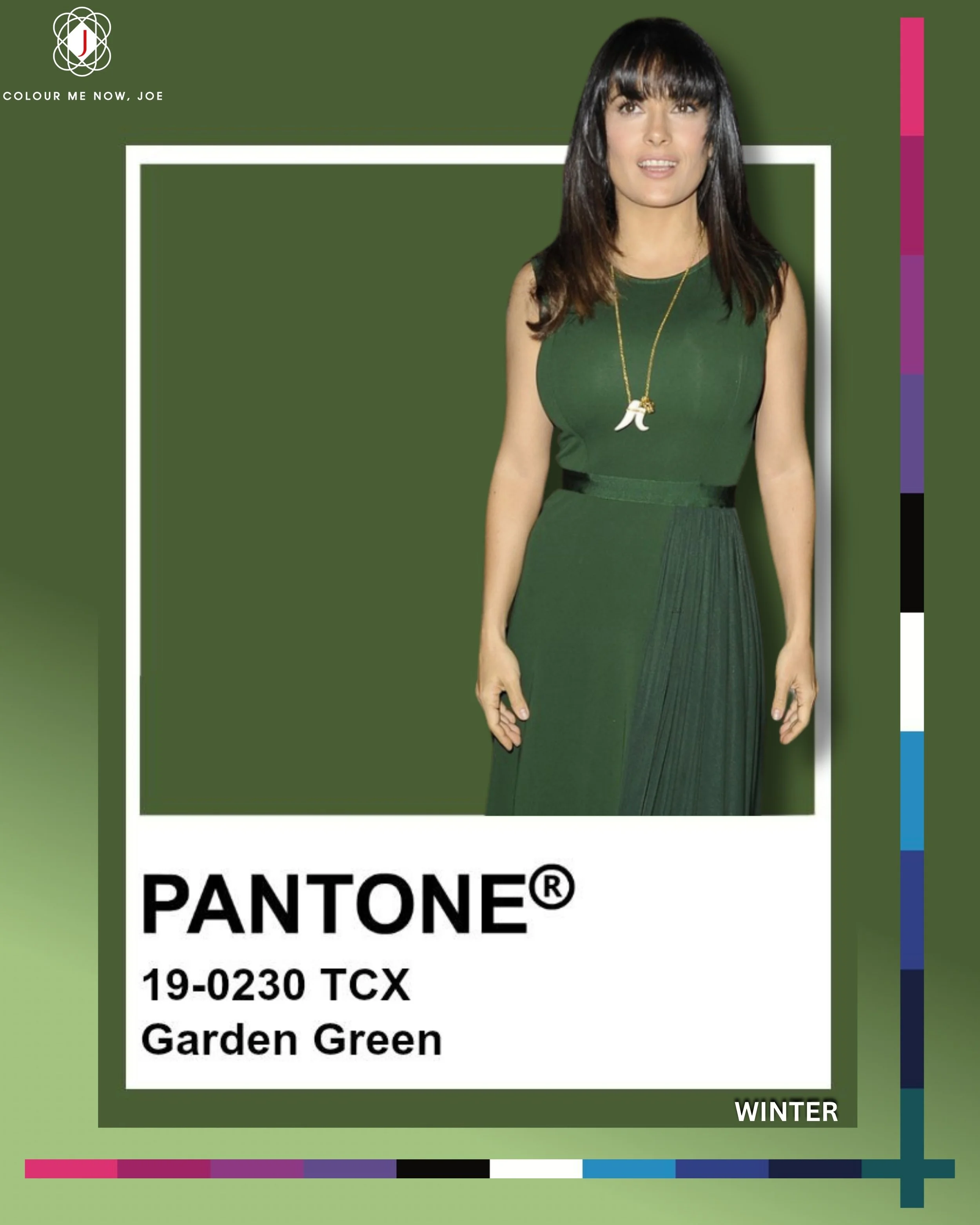
Garden Green is a rich, natural mid-tone green that captures the essence of fresh foliage and thriving landscapes. It feels earthy, revitalising, and grounded, evoking the lush serenity of a well-tended garden. Balanced between warm and cool, it brings a sense of organic calm and timeless freshness—perfect for eco-conscious design, fashion, and interiors. Pair beautifully with soft neutrals, for more contrast, combine it with deep tones, or a soft pastels to add freshness and depth. Perfect for warm undertone types

Curds and Whey is a soft, warm off-white with a creamy, natural undertone—like the gentle hue of hand-whipped cream or unbleached linen. It radiates comfort, purity, and subtle warmth, making it a perfect seasonless neutral. This shade feels inviting and effortless, ideal for creating relaxed elegance in fashion. Pantone’s Curds and Whey pairs beautifully with earthy tones like taupe, greens, and brown for a grounded, organic look. For a fresher contrast, combine it with soft pastels like blue or lilac to keep the palette airy and modern. A perfect neutral for people with warm undertone

A soft, muted brown with a gentle flush of rose underneath — like chocolate milk stirred with a hint of blush. It feels earthy yet romantic, balancing grounded warmth with a whisper of cool pink. Think vintage suede or sun-warmed clay kissed by dusk. It pairs beautifully with dusty pinks, muted mauves, and creamy neutrals for a refined, feminine palette — or contrast it with deep teal or olive for richness. Perfect for summers as a neutral (can be hard to find) ;)