
LFW AUTUMN/WINTER 25/26
LFW AUTUMN/WINTER 25/26

Pantone Colour Institute experts highlight that the colour palette seen in LFW Autumn/Winter 2025/2026 artfully combines creativity, innovation, heritage, and transformation to inspire a fresh perspective.
The collection’s rich colour depth sets a compelling mood through grounded earth tones paired with soft hints of tinted whites and lavender blues. These blend seamlessly with vivid reds and environmentally inspired blues and greens, enhancing the narrative of the season.
This fusion mirrors consumers’ growing mindfulness and intentionality in their choices, merging familiar staple hues with bold, vibrant shades. This dynamic encourages experimentation and reinvention, empowering individuals.

Lavender Blue is the first colour of the Autumn-Winter 2025/26. Lavender Blue is a serene, lilac-tinted pastel with a cool, airy undertone, evoking the softness of twilight skies and the elegance of antique porcelain. Its delicate hue feels romantic yet fresh, making it perfect for adding lightness to autumn and winter palettes. Pair Lavender Blue with warm ambers or terracottas for contrast, deep navy or forest green for sophistication, or soft neutrals and fresh greens for a light, romantic harmony. Perfect colour for summer types
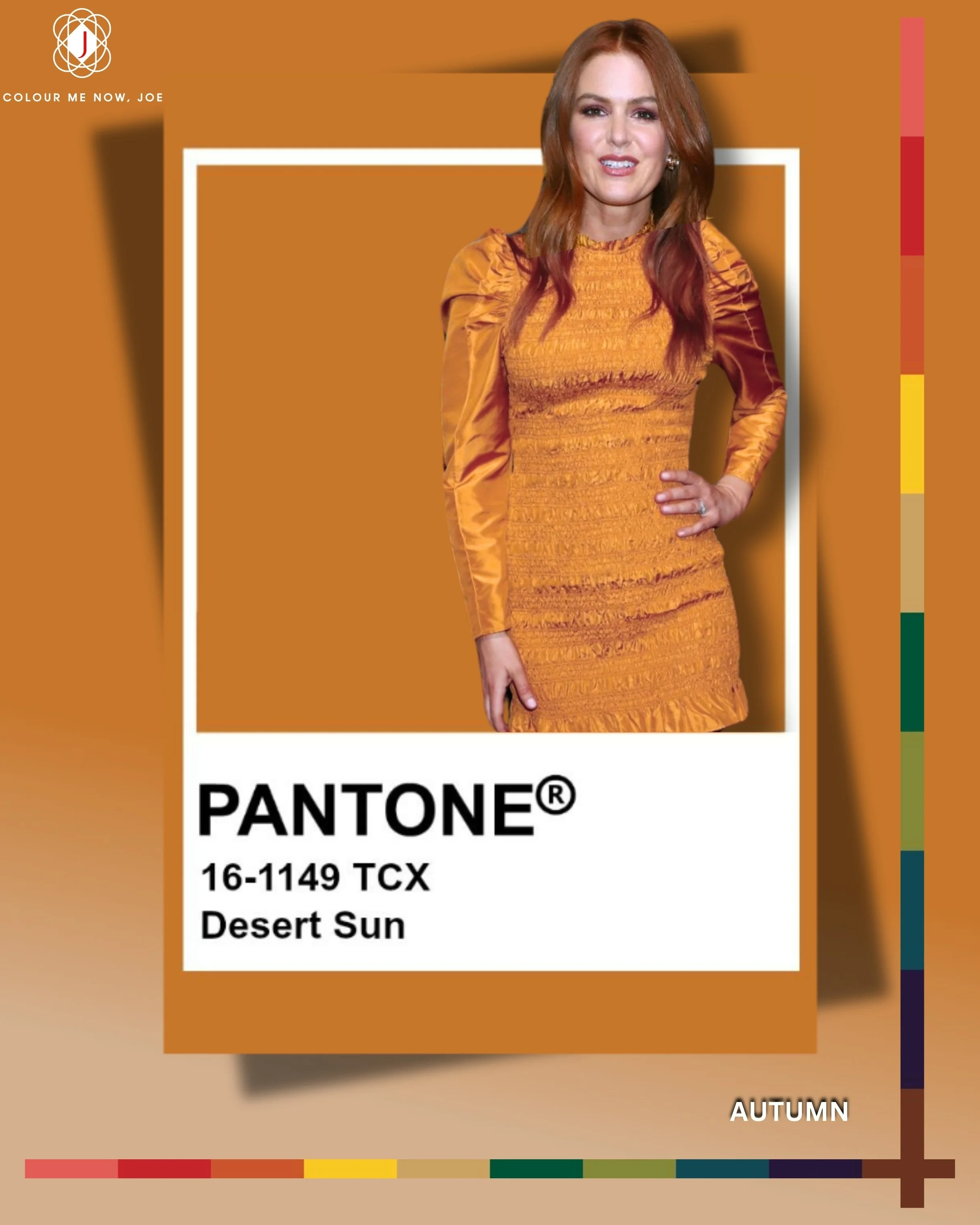
How can you talk about autumn without mentioning orange?! Desert Sun is a warm, tawny orange with sun-baked depth, reminiscent of late-afternoon light over golden dunes. It radiates comfort and energy, making it ideal for adding warmth to autumn and winter looks. Pair it with deep browns or olive greens for an earthy feel, soft blues or lavenders for balance, or creamy neutrals for a sun-kissed elegance. Amazing colour for autumn types
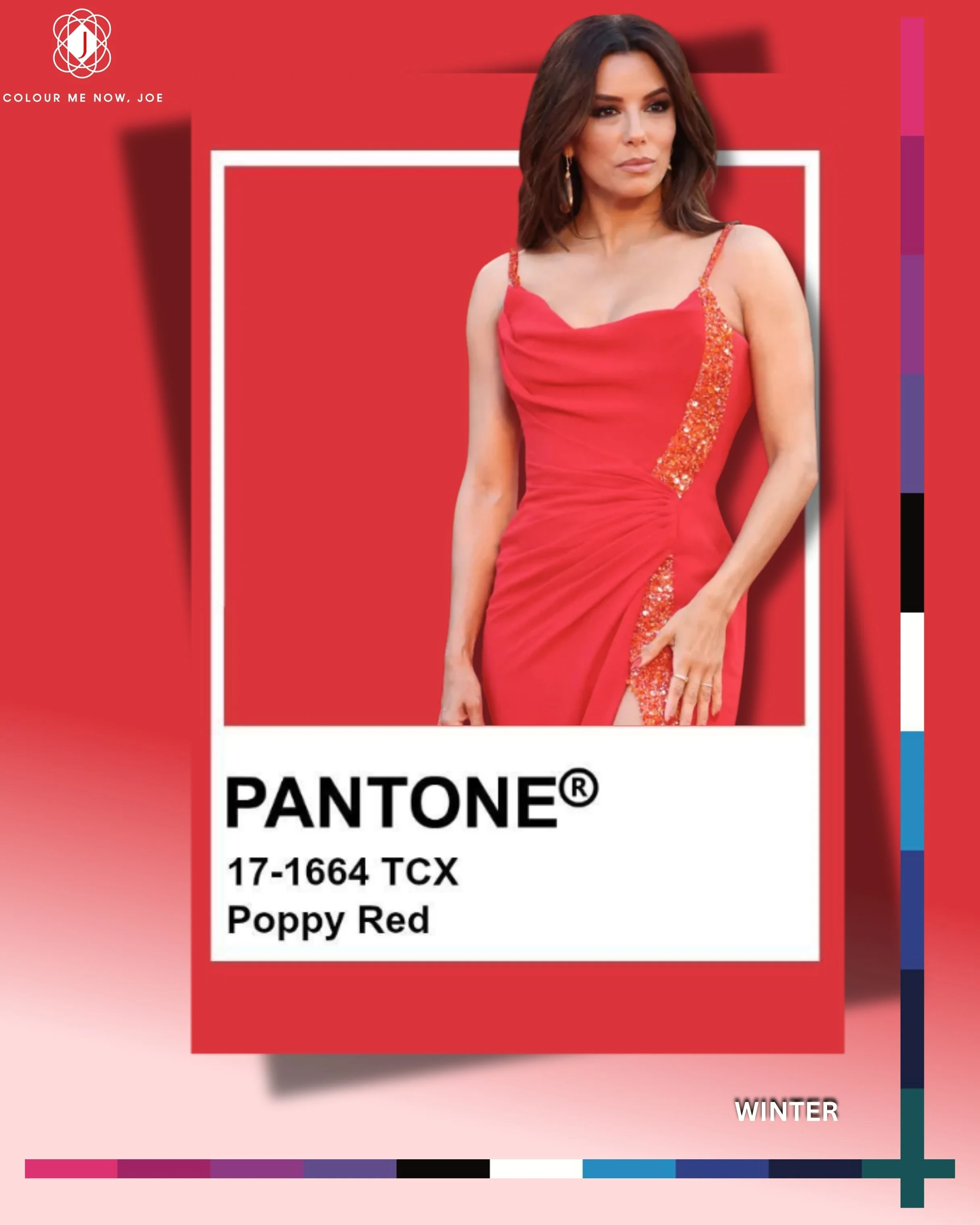
Pantone’s Poppy Red is a bold, energetic scarlet with a fiery vibrancy that instantly commands attention. It carries a playful yet sophisticated undertone, making it both daring for statement pieces and timeless for classic styling. Radiating warmth and passion, this shade embodies confidence, movement, and a touch of modern romance. It pairs beautifully with crisp whites and blacks for contrast, soft neutrals like beige or taupe for balance, and vibrant shades like cobalt blue, fuchsia, or emerald green for a striking, fashion-forward statement. Perfect red for winters.
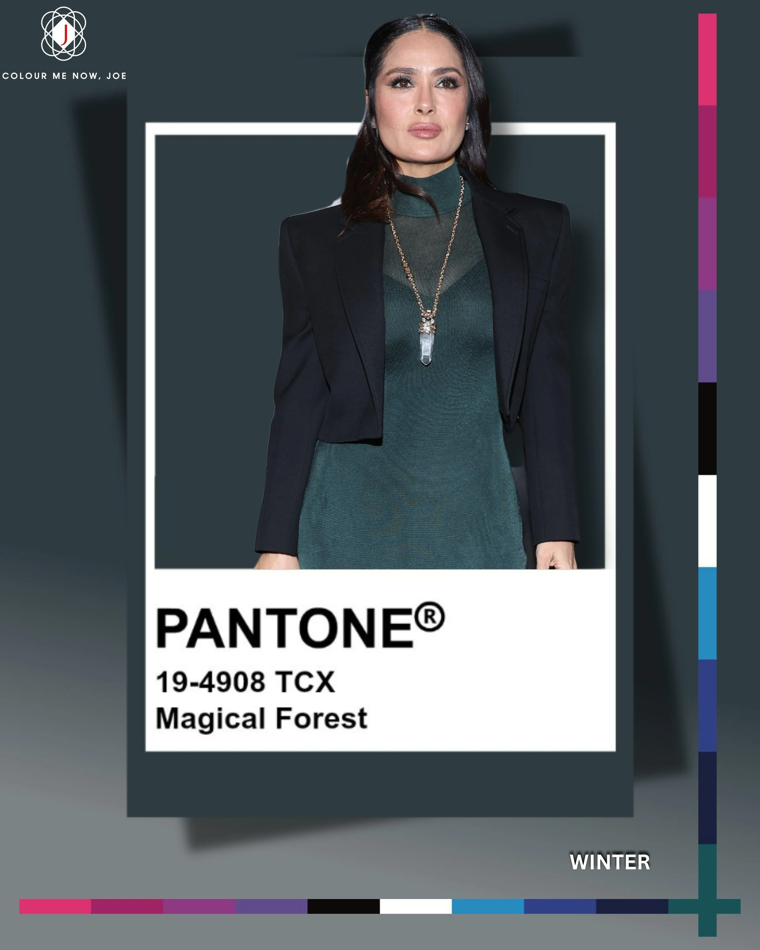
Magical Forest is a lush, deep green with an earthy, almost mysterious undertone, evoking dense woodlands and timeless natural elegance. Its rich depth makes it both grounding and luxurious, perfect for autumn and winter styling. Pair it with warm rusts or terracotta for a cosy contrast, soft creams or taupe for balance, or jewel tones like sapphire and amethyst for an opulent, layered look. Perfect for people with dark/deep dominant characteristics, therefore Winter and Autumn deep.
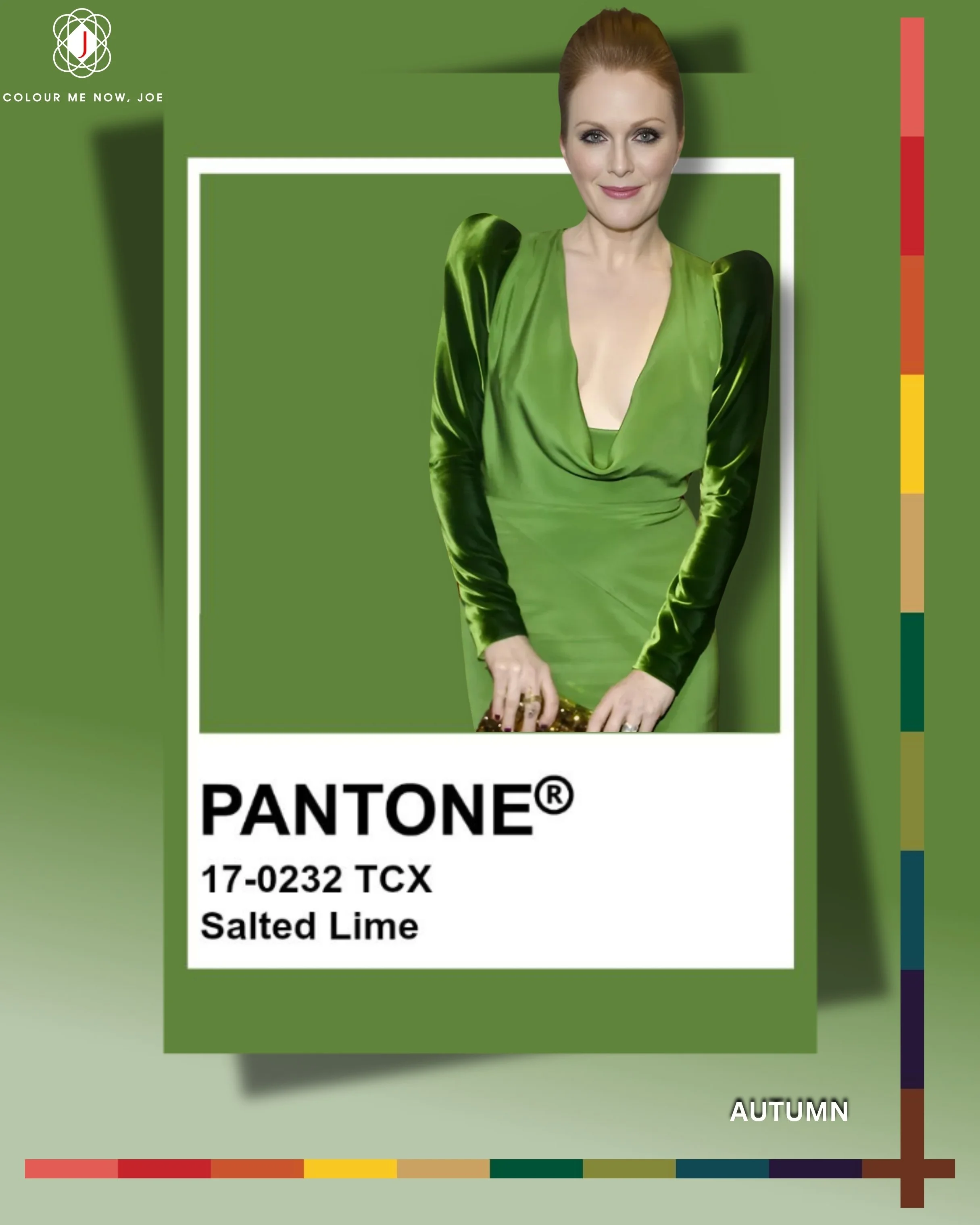
Salted Lime (not a typical autumn colour) is a zesty, yellow-green with a fresh, botanical brightness, reminiscent of crisp citrus peel and the first shoots of spring. It’s playful yet invigorating, adding a lively pop to cool- or warm-toned outfits. Pair it with navy or deep plum for bold contrast, soft beige or cream for a fresh balance, or other greens and yellows for a vibrant, tonal statement. Designed to enhance warm undertones, particularly stunning on redheads.
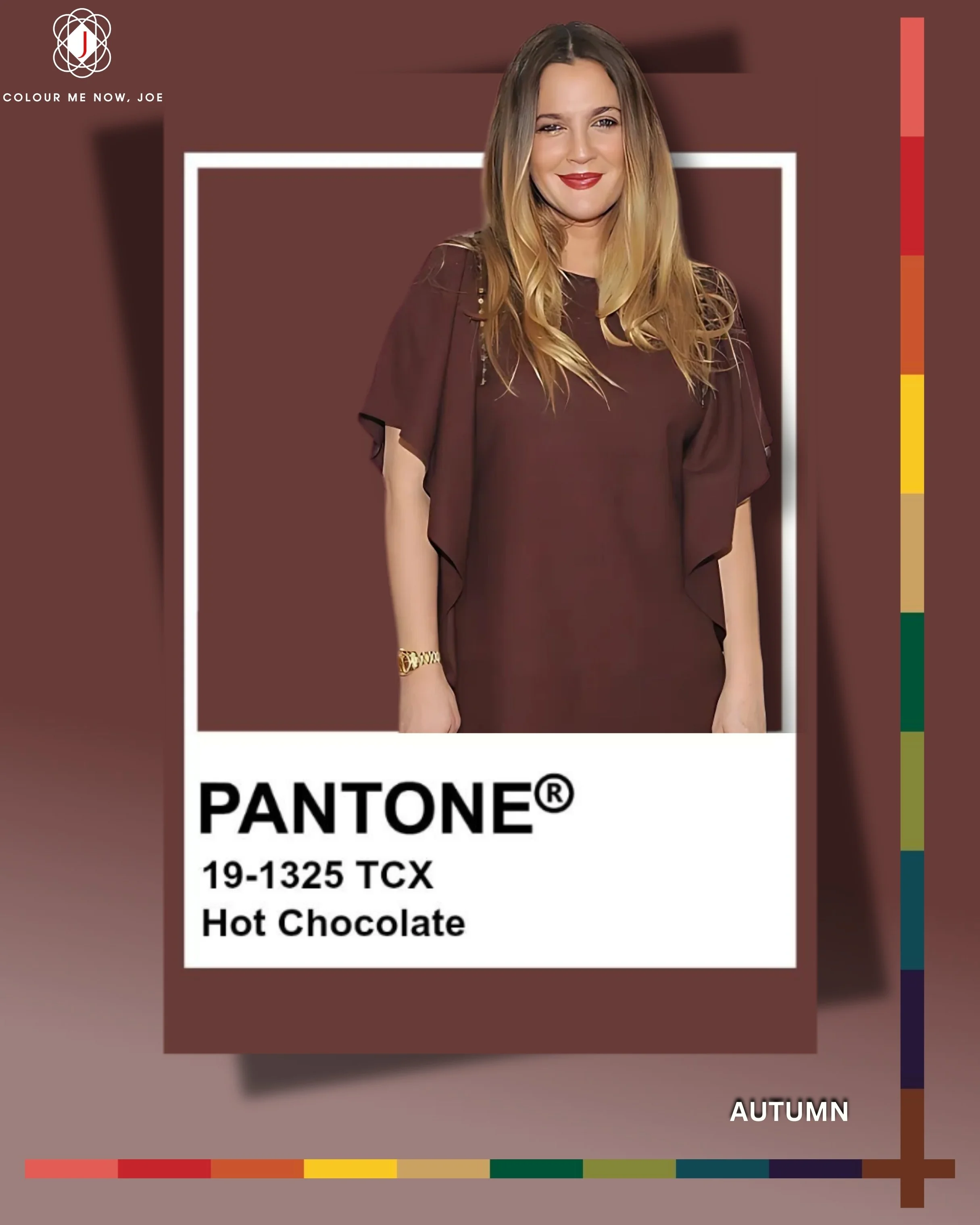
Hot Chocolate (another colour of #lfw25) is a smooth, medium-dark brown with warm, comforting undertones, evoking the richness of cocoa and the coziness of winter evenings. It’s versatile and grounding, lending depth and warmth to both casual and refined looks. Pair it with creamy ivories or camel for classic elegance, deep greens or teals for an earthy sophistication, or blush and dusty rose for a soft, romantic contrast. Perfect for Autumns 🤎
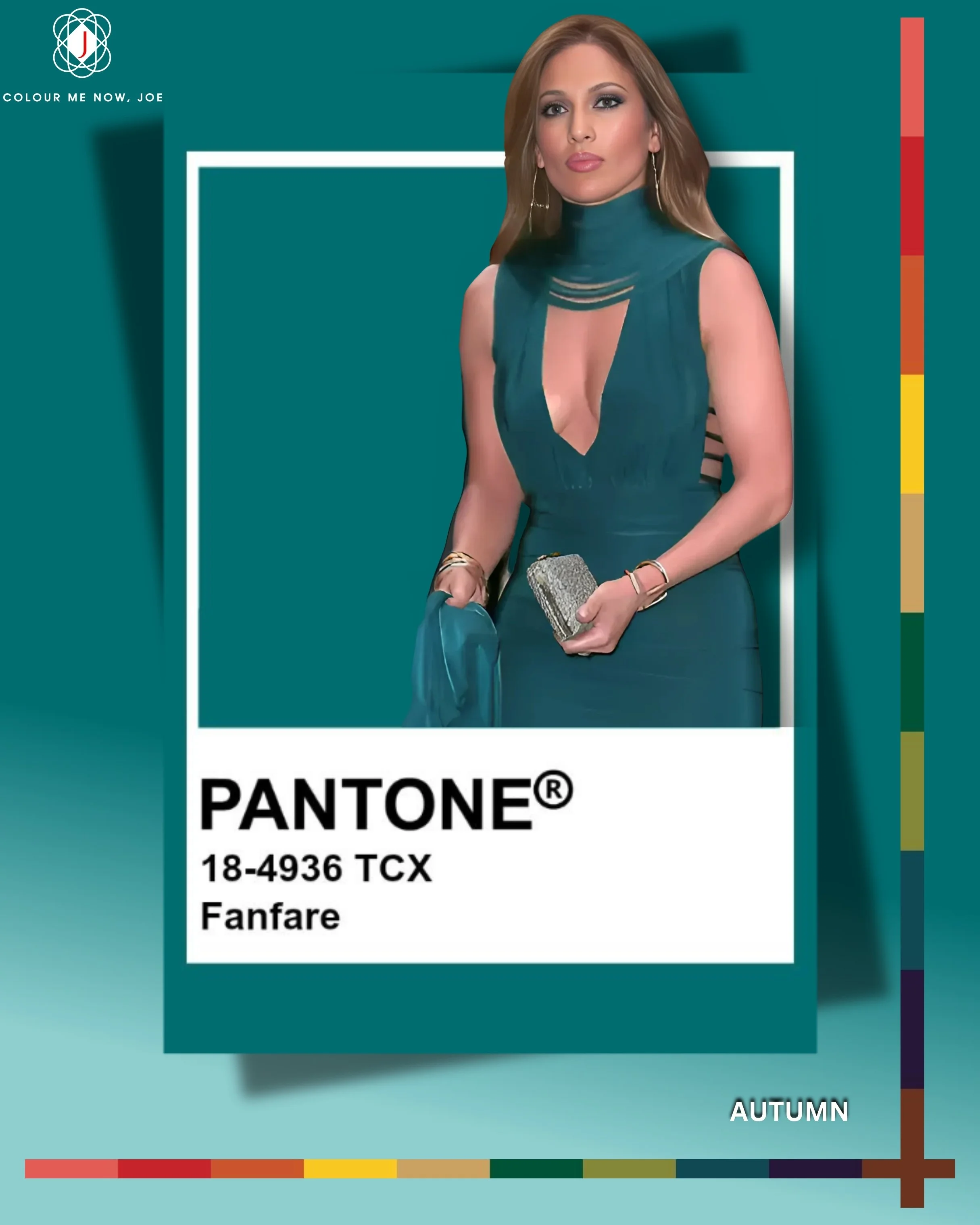
Fanfare is a deep, refined blue-teal with a warm, velvety undertone, blending the sophistication of navy with the vibrancy of turquoise. It feels luxurious and contemporary, making it perfect for statement pieces or rich accent layers. Pair it with warm camel or rust for an elegant contrast, soft grey or ivory for a crisp balance, or jewel tones like emerald and amethyst for a decadent, layered effect. Amazing for Autumns, especially those who belongs to the deep subgroup.
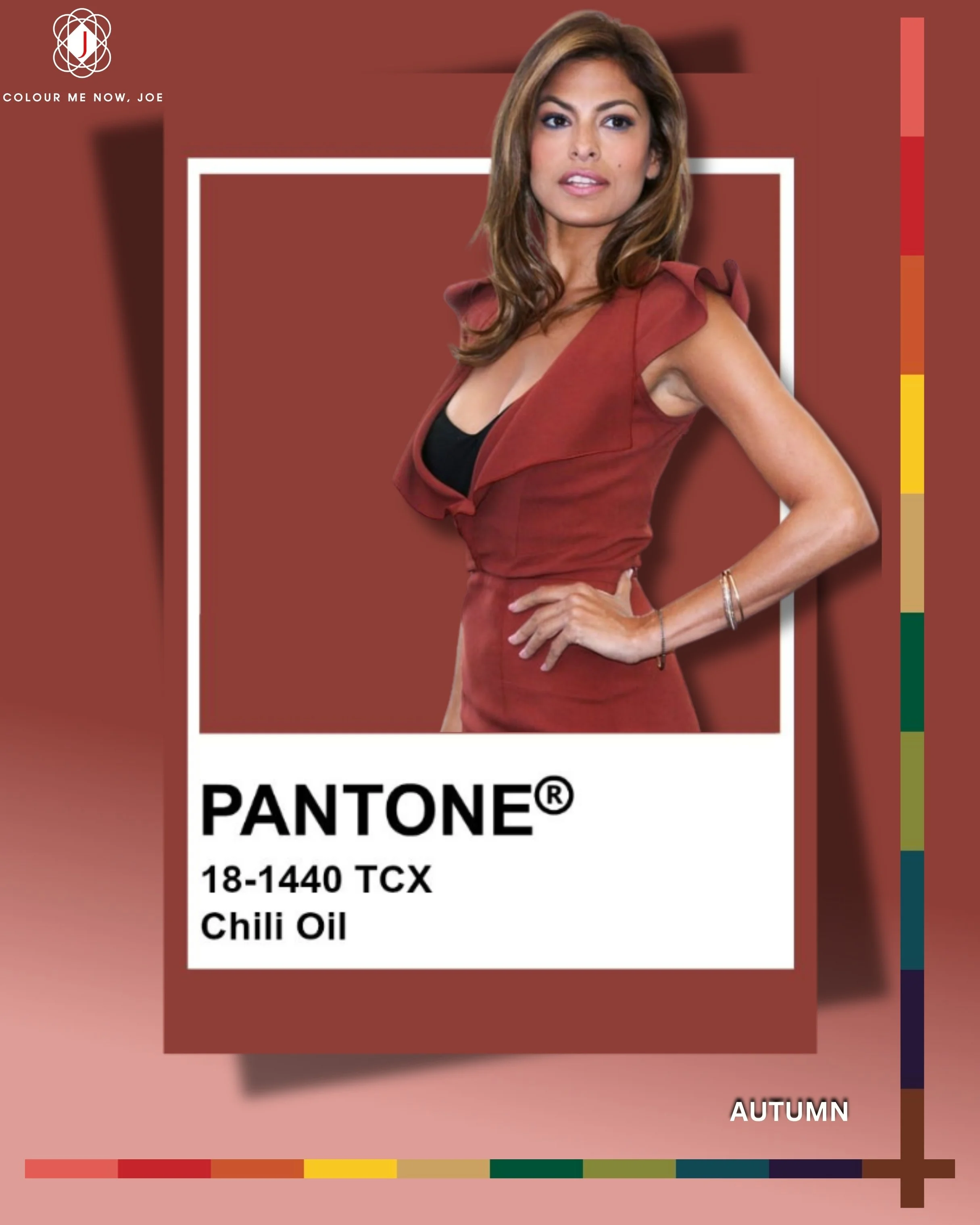
Chili Oil is a deep, earthy red-brown with warm undertones—rich, spicy, and sophisticated. Because it sits between red and brown, it pairs beautifully with both neutrals and bold accents, such as deep navy or forest green for striking contrast, creamy beige or soft grey for balance, or gold and bronze accents for a luxurious, glowing finish. Amazing colour for Autumns
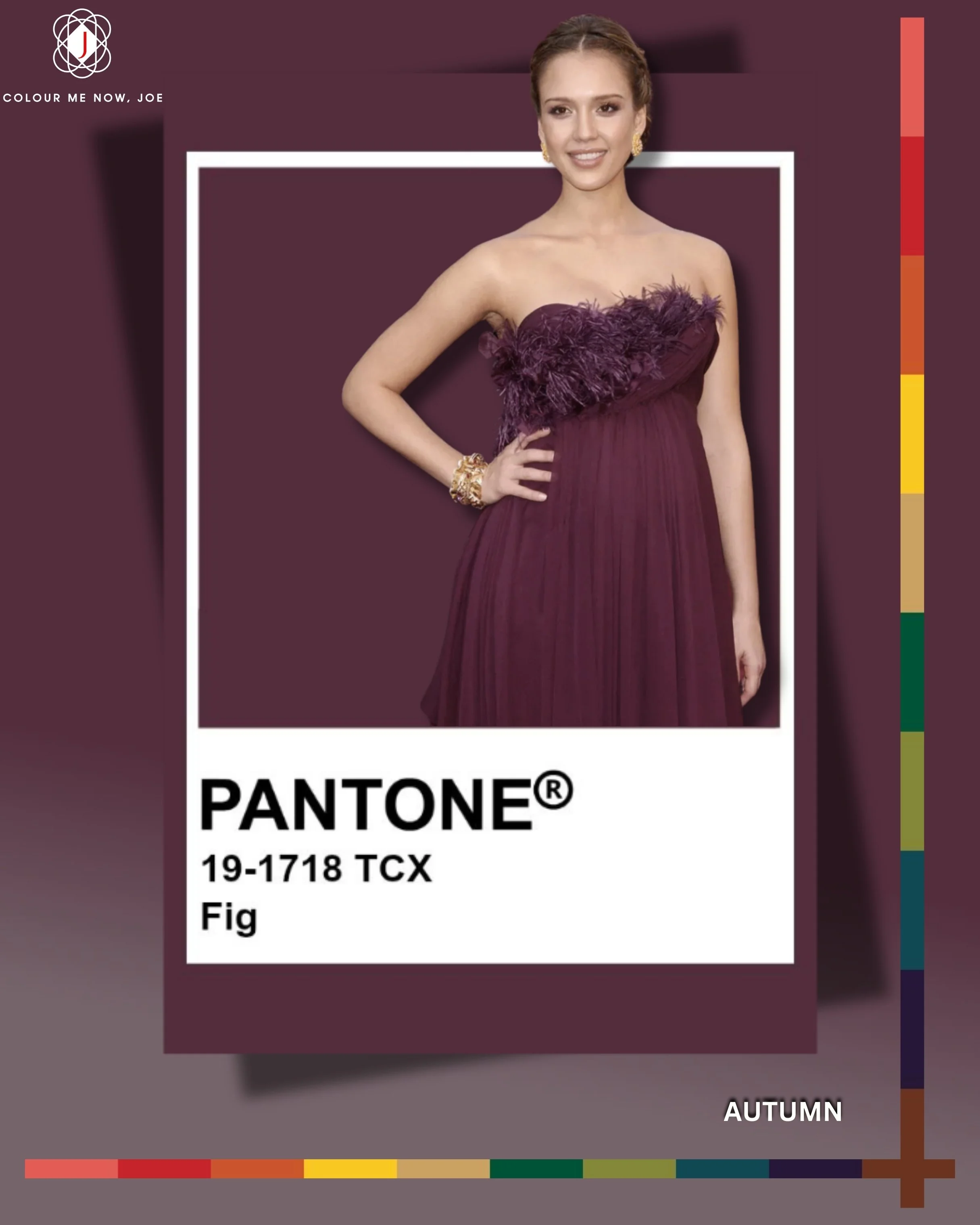
Fig is a deep, moody plum-brown with a velvety richness, reminiscent of ripe fruit and vintage wine cellars. It carries an air of quiet luxury, making it perfect for adding depth and drama to autumn and winter looks. Pair it with soft blush or dusty pink for a romantic touch, deep teal or forest green for an opulent contrast, or warm camel and gold for a sophisticated, autumnal harmony. I found it very nice with sky blue too. Perfect for autumns, especially those in deep subgroup.
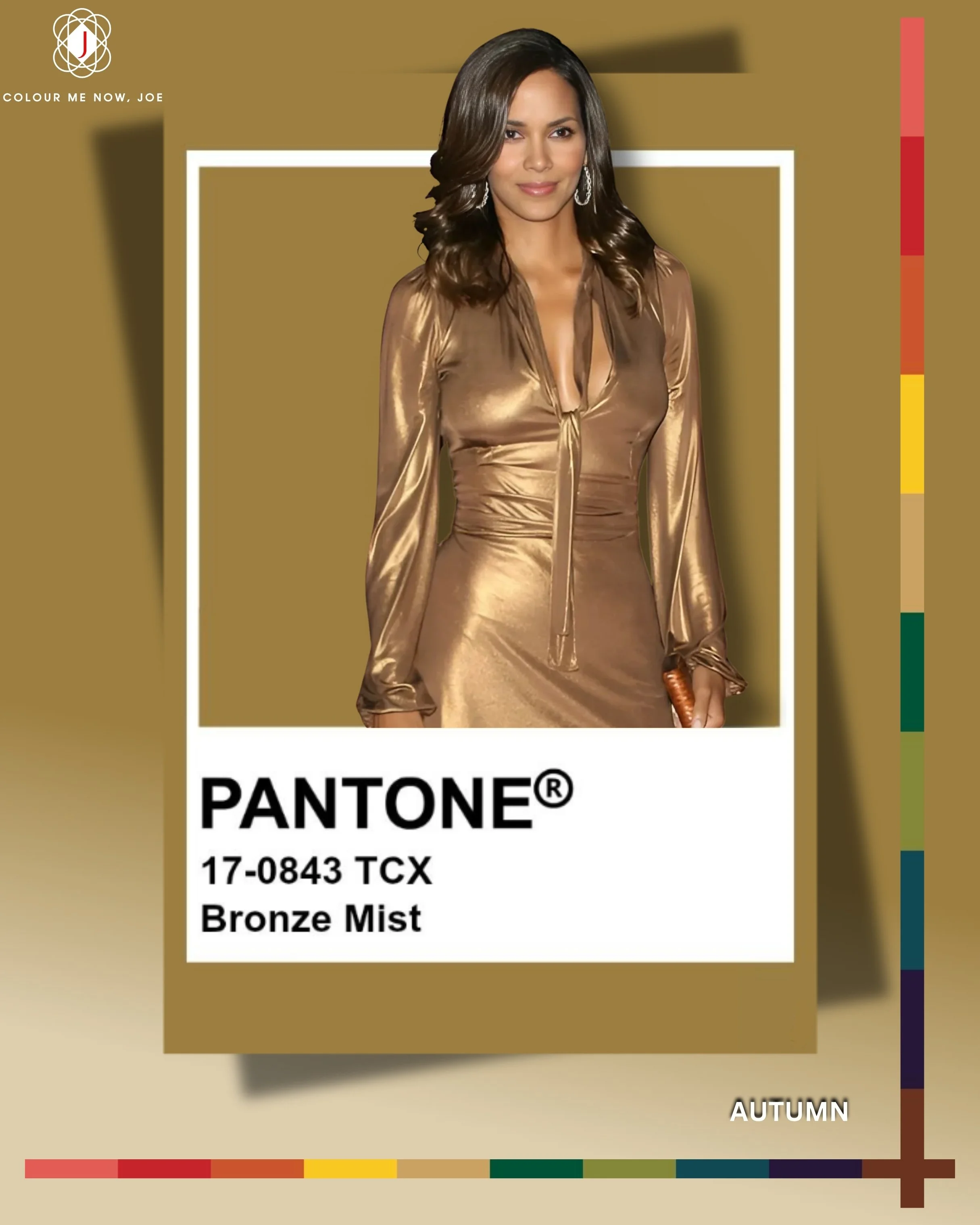
Bronze Mist is a muted, golden-bronze with a soft, burnished glow, evoking the patina of aged metal and the warmth of autumn light. It’s elegant yet understated, adding a refined shimmer to both casual and dressy looks. Pair it with deep navy or forest green for regal contrast, creamy ivory or taupe for subtle sophistication, or rich burgundy and plum for a luxurious, jewel-toned palette. If you dare, wear on its own. Perfect for autumns.
The classic colours of the season — Wispy Clouds, Dark Gull Grey, Crown Blue, Cumulus Cloud, and Chocolate Martini form a refined, timeless base for modern wardrobes. They bring balance and sophistication, acting as elegant anchors to the more expressive shades of the collection. Wispy Clouds adds a gentle, airy contrast that lightens deeper tones like Chocolate Martini or Crown Blue, creating harmony between softness and depth. Dark Gull Grey delivers quiet strength and pairs beautifully with seasonal greens or the vivid Poppy Red for a confident, urban look. Crown Blue lends a regal depth that enhances neutrals like Cumulus Cloud or fresh seasonal accents such as Salted Lime. Cumulus Cloud works as a subtle mid-tone neutral, ideal for layering or grounding brighter combinations like Fanfare or Bronze Mist. Finally, Chocolate Martini wraps it all in warmth and richness — a luxurious brown that flatters almost every palette and instantly adds depth, comfort, and polish.

Wispy Clouds is a soft, weightless white that feels like morning light on silk — clean, effortless, and pure. It adds freshness to any palette and beautifully highlights textures like cashmere, lace, or crisp cotton. Pair it with earthy browns or olive greens for warmth, navy or charcoal for sophistication, or pastels for a dreamy, romantic touch.

Dark Gull Grey is a cool, moody neutral that feels urban, sleek, and endlessly versatile. It anchors bold colours and gives subtle drama to tonal looks, making it a favourite for tailoring and outerwear. Pair it with burgundy or burnt orange for energy, soft beige for balance, or metallic accents for a contemporary edge.

Crown Blue is a regal navy infused with depth and confidence, timeless yet always modern. It lends power to any look — sharp in tailoring, refined in eveningwear, and effortless in denim or wool. Pair it with camel or tan for a classic feel, white or silver for crisp contrast, or forest green for quiet luxury.

Cumulus Cloud is a calm, misty grey that brings quiet balance and gentle refinement. It’s the perfect bridge between light and dark tones, giving a modern softness to structured silhouettes. Pair it with blush or camel for elegance, deep teal or aubergine for contrast, or monochrome layers for minimalist polish.

Chocolate Martini is a rich, smooth brown that feels grounded, sensual, and sophisticated. It evokes the warmth of leather, espresso, and autumn light — a perfect base for cozy or elegant ensembles. Pair it with ivory or sand for softness, deep red or mustard for vibrancy, or gold and copper for a luxurious finish.